Notre site dispose désormais d'un mode éco. N'hésitez pas à l'essayer !
Learn the keys to creating an effective landing page that maximizes your conversion rates and generates tangible results for your business.
Before diving into the details, it’s important to clarify what a landing page is. In digital marketing, a landing page is a web page specifically designed to prompt visitors to take a particular action that aligns with your goals, such as signing up for a newsletter, purchasing a product, or filling out a form.
To test the effectiveness of your landing page, there are various traffic acquisition channels like email marketing, SEA/SEO, display ads, social media, etc. Determine which works best for you, or contact us here!
Here’s a good example of a high-conversion landing page. Have you heard of NordVPN? (Chances are you have...) Here is one of their landing pages.
You might wonder why “their” landing pages? Simply because their presence and acquisition budgets require almost constant optimization to maximize their spend.

This landing page includes several essential components of an effective landing page, such as:
Now that you know a bit more about what a landing page is, it’s time to move to the second step!
When it comes to creating a landing page that converts, the headline is one of the most important elements. It’s the first thing visitors see when they land on the page, and it must be catchy enough to grab their attention and entice them to read on.
A good headline should be clear, concise, and focused on the benefit offered to visitors. It should also align with the goal of your landing page, whether it’s encouraging visitors to sign up for a newsletter, buy a product, or fill out a form.
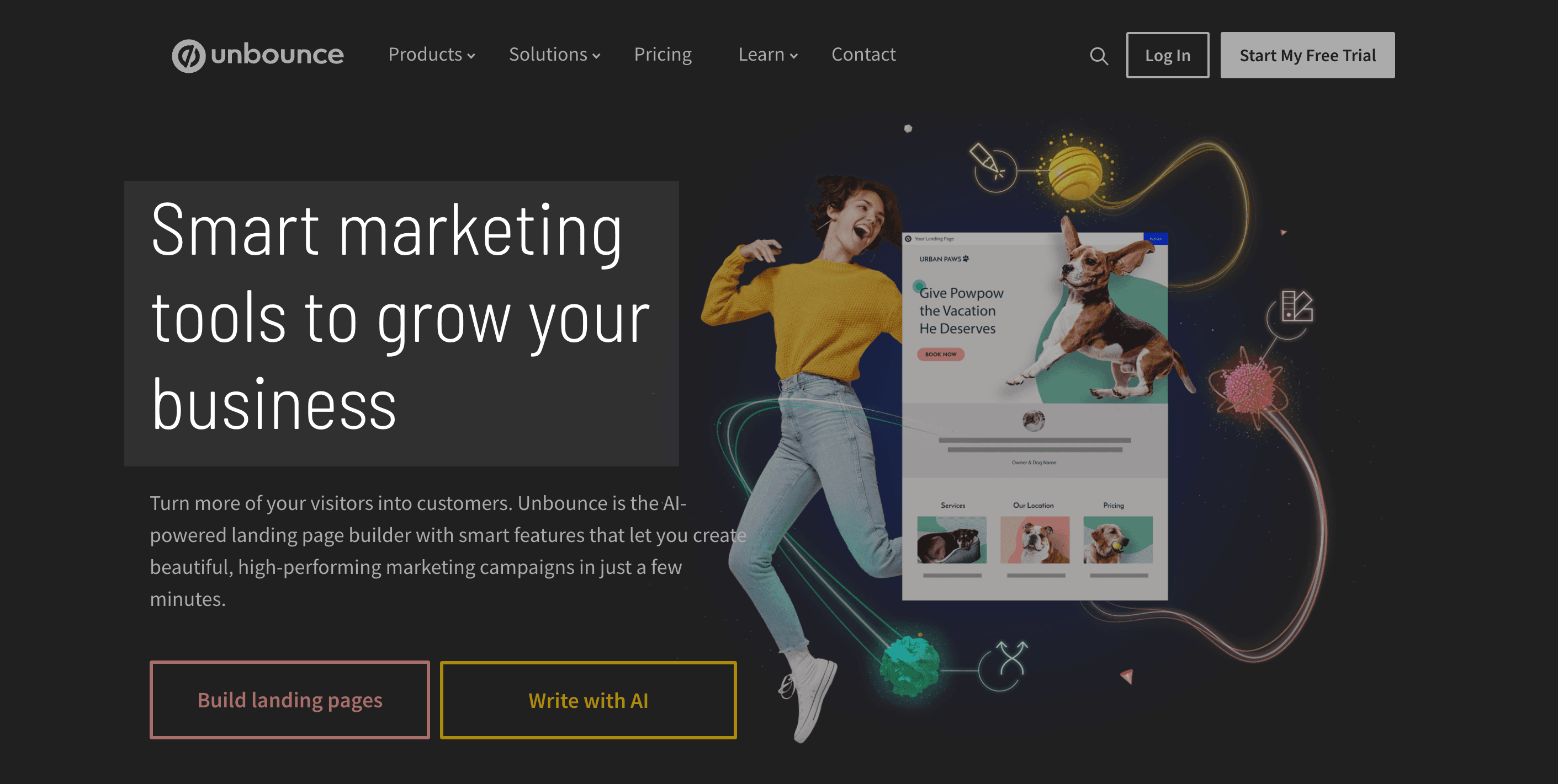
Unbounce, a landing page builder, is a good example. The headline is clear and speaks to everyone: grow your business with our tool. It’s not uncommon to also see a subtitle briefly highlighting the tool’s benefits, like here, “turn more of your visitors into customers…”.

There are different techniques for writing catchy headlines, such as using numbers, questions, action verbs, or promises of results. The key is to choose a technique that suits your target audience and the objective of your landing page.
It’s also important to test several headlines to determine which works best. By using analysis tools, you can measure the effectiveness of different headlines in terms of conversion rate and visitor engagement.
In summary, a catchy headline is essential for creating a landing page that converts. By using the appropriate techniques and testing, you can find the perfect headline for your landing page and improve the results of your marketing campaign.
And since we at Adwire like to share our secrets (not all… but a good part), here is a formula you can reuse for your landing page headlines and subheadings:
A well-designed layout is essential for creating a landing page that converts. A layout that facilitates navigation and understanding of information can help visitors focus on the offer and take the desired action.
To design an effective layout, it’s important to follow basic design principles, such as using consistent colors and fonts, prioritizing information, and highlighting important elements.
It’s also important to consider the goal of your landing page and design the layout accordingly. For example, if the goal of your page is to sell a product, you should highlight the product’s features, customer testimonials, and the purchase button. Another example, if your goal is for the user to fill out a contact form, you might highlight (simply) your expertise, the number of leads generated…
Finally, simplicity is often the key to an effective layout. Avoid superfluous elements, hard-to-read fonts, and heavy images that can slow down your page loading time.
It’s important to test different layouts to determine which works best in terms of conversion rate and visitor engagement.
In summary, an effective layout is essential for creating a landing page that converts. By following basic design principles, considering your page’s goal, and testing different layouts, you can improve your landing page’s effectiveness and achieve your marketing campaign goals.
A call-to-action (CTA) is the key element of your landing page that prompts visitors to take a specific action. To maximize conversions, it’s important to create a clear and compelling CTA.
First, it’s essential to choose the right verb for your CTA. Action verbs like "download," "buy," or "sign up" are often the most effective because they clearly indicate the action you want visitors to take.
Next, it’s important to place your CTA visibly and strategically on your landing page. It’s often effective to place it at the top of the page, below the header section, or in another prominent location that catches visitors’ attention.
It’s also important to make your CTA visually stand out from your landing page. This can be achieved by using a contrasting background color, a larger font size, or a distinctive CTA button.
Finally, it’s important to offer a clear incentive to encourage visitors to take the desired action. This can be in the form of a discount, a free trial, or a free gift.
In summary, a strong call-to-action is essential for maximizing conversions on your landing page. By choosing the right verb, placing it strategically, making it visually stand out, and offering a clear incentive, you can encourage visitors to take the desired action and achieve your campaign goals.
Optimizing your landing page for conversions is essential to maximize the return on investment of your marketing campaign. Here are some key elements to consider for optimizing your landing page for conversions:
Moreover, most ad platforms (Google Ads, Meta Ads…) allow conversion optimization through smart bidding strategies as long as they have generated some data through your campaigns. If all this seems too abstract, feel free to contact us here.
In summary, optimizing your landing pages for conversions is essential because conversion is closely linked to your business’s success (at least in part).
Having an effective landing page is essential for success and longevity in digital marketing. By keeping in mind key elements such as message clarity, crafting a compelling value proposition, using social proof elements, personalization, choosing a clean and optimized design, creating a compelling call-to-action, and optimizing for conversions, you can create a landing page that prompts visitors to take the desired action and achieve your goals.
Remember that creating an effective landing page is an ongoing process, and it’s important to regularly test different elements to see what works best. By maintaining an analytical approach, you can continuously improve your landing page’s performance and maximize the return on investment of your campaigns.